

If you’re here, you’re probably knee-deep in paint swatches and second-guessing every decision. We get it. Choosing an interior paint color for your interior painting project isn’t just about picking something that looks good—it’s about finding something that works for you. And since you’ll be living with this choice for a while, it pays to do it right.
Our guide will help you cut through the noise, stay focused, and feel confident in your decision. Let’s get started.
Step 1: Identify the Star of the Show
Think of your room like a movie—there can only be one main character. Everything else plays a supporting role. When you walk into the space, ask yourself: What do I want to stand out?
If it’s your furniture or artwork, go with neutral or subtle tones that won’t compete.
If you want the walls to take center stage, choose a bold or distinctive color that makes an impact.
Anytime indecision creeps in, come back to this question: Who’s the star of the show? That’s your North Star.
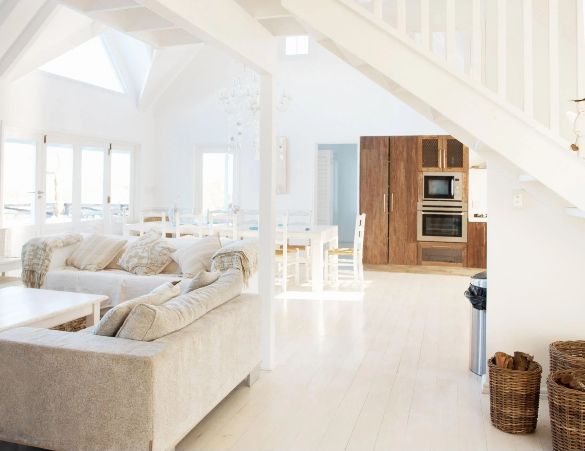
Step 2: Understand Tones and Undertones
Before you start swiping through color palettes, take stock of what’s staying in the room. Flooring, cabinets, furniture: these elements have their own color tone, and your paint needs to play nice.
Here’s a quick breakdown:
Tones: The overall feel of the color, warm (beiges, reds) or cool (grays, blues).
Undertones: The subtle hints within a color that can shift how it looks in different lighting.
A beige might have a pink undertone, or a gray might lean blue. Knowing this upfront will save you from surprises once the walls are painted.

Step 3: Start Exploring Colors Now
The sooner you start looking, the better. You don’t want to be making rushed decisions while a painter waits on standby.
Here’s the best way to research:
Google: Search for phrases like “best warm living room colors” to get a baseline.
Pinterest: Look up specific paint colors to see them in real spaces.
YouTube: Channels like The Paint People break down how colors perform under different lighting conditions.
Step 4: Narrow It Down with Sample Boards

Paint chips are tiny and misleading. The best way to know how a color will truly look is to test it big.
- Grab 2’ x 2’ poster boards and paint them with sample-sized paints.
- Move them around the room and check them in different lighting conditions.
- If you’re considering multiple colors, place them side by side to see how they interact.
For an easier option, check out Samplize. They offer peel-and-stick samples of popular paint colors that ship overnight. They’re smaller than poster boards (9” x 14”), but still give a good idea of how the color will look.
Step 5: Trust Your Gut (Not Your Friends)
You’ll know the right color when you see it. Some people make a choice instantly, while others need time to sit with it. Either way, trust yourself.
One mistake we see often? Asking friends or family for input. Unless they’re an interior designer, they’ll likely steer you toward their preferences instead of what’s best for your space.
When in doubt, return to your North Star. The goal is to choose a color that works for you, not anyone else.

How Color Shapes Mood and Space
The colors on your walls do more than complement your decor. They can influence the atmosphere of your home, affecting mood and even changing how large a room feels. Here’s a look at how different color families tend to work.
Warm Hues: Energizing and Inviting
Warm colors, such as red, orange, and yellow, bring a burst of energy and a welcoming vibe to any space.
- Red: Bold and passionate, red is fantastic for areas like the living and dining rooms, encouraging warmth and conversation.
- Orange: This cheerful color is perfect for spaces where creativity and activity bloom, like exercise rooms or play areas, adding a sense of fun and warmth.
- Yellow: Bright and sunny, yellow works wonders in kitchens and bathrooms, creating an uplifting and vibrant atmosphere.
Cool Tones: Calming and Serene
The cool side of the color spectrum, with blues, greens, and purples, offers tranquility and relaxation.
- Blue: Ideal for bedrooms and bathrooms, blue’s calming effect can help reduce stress and promote peacefulness.
- Green: With its refreshing and restorative qualities, green is suited for almost any room, balancing relaxation with a hint of warmth.
- Purple: From the luxurious depth of dark purples to the gentle touch of lavender, purple is excellent for spaces dedicated to creativity or relaxation.
Neutral Shades: Elegant and Versatile
Neutrals like white, gray, and beige provide a sophisticated backdrop that can easily be adapted to any style.
- White: Offering a clean and spacious feel, white is incredibly versatile, working well in any room, especially those lacking in size or natural light.
- Gray: Chic and balanced, gray is a modern choice for living spaces and kitchens, blending well with both vibrant and subdued accents.
- Beige and Browns: These earthy tones bring warmth and stability, perfect for creating a grounded and inviting environment in living rooms and home offices.
Using Light and Dark to Shape Your Space
- Expand with Light: Lighter colors can make smaller rooms feel more open and airy.
- Cozy Up with Dark: Darker shades can lend a snug and intimate feel to larger spaces, making them feel more inviting.
Compare the main color families before you pick up a sample.
Best in: Living and dining rooms
Encourages warmth and conversation
Best in: Exercise rooms, play areas
Adds fun and creative energy
Best in: Kitchens and bathrooms
Uplifting, vibrant atmosphere
Best in: Bedrooms and bathrooms
Can help reduce stress, promotes peace
Best in: Almost any room
Balances relaxation with a hint of warmth
Best in: Creative or relaxation spaces
Dark purples feel rich, lavender feels soft
Best in: Small or low-light rooms
Versatile in any room
Best in: Living spaces and kitchens
Modern, pairs with bold or subdued accents
Best in: Living rooms and home offices
Grounded, inviting
Need Help Choosing the Perfect Color?
At Big Dog Painting, we help homeowners find the right colors for their space. Whether you need a little guidance or a full-on consultation, we’re here to make the process stress-free.
Call us today to schedule a free estimate and let’s get your space looking exactly how you envision it.
Frequently Asked Questions
How do I know if a color is too dark or too light?
Test it. Colors look different under various lighting conditions, so sample it on a large board and check it in morning, afternoon, and evening light.
Should all rooms in my house be the same color?
Nope! But they should flow. If you’re using different colors, try to keep them in the same family (warm tones with warm tones, cool tones with cool tones) to maintain a cohesive look.
What’s the best paint finish for interior walls?
- Flat/matte: Hides imperfections but can be harder to clean.
- Eggshell: A slight sheen that’s easier to clean, great for most living spaces.
- Satin: More durable and good for high-traffic areas.
- Semi-gloss: Great for trim and doors.
- Gloss: Shiny and durable, usually for accent pieces.
From flattest to shiniest: what each finish does best.
| Finish | Sheen | Key trait | Durability / cleaning | Best for |
|---|---|---|---|---|
| Flat / Matte | Hides imperfections | Low (harder to clean) | Low-traffic walls, ceilings, imperfect surfaces | |
| Eggshell | Slight sheen, easy to clean | Medium | Most living spaces | |
| Satin | More durable | Medium-high | High-traffic areas | |
| Semi-gloss | Great for trim and doors | High | Trim and doors | |
| Gloss | Shiny and durable | Highest | Accent pieces |
How many paint samples should I test?
Start with 3–5. Any more than that can be overwhelming.
Ready to Pick the Right Color?
Get a free, on-site estimate and a second set of eyes on color, sheen, and prep before you commit.
Request a Free Estimate →See our interior portfolio for real New England homes, or read testimonials from past clients.