
How to Choose an Interior Paint Color
A Foolproof Guide to Interior Paint Colors
If you’ve stumbled upon this blog, you’re probably in the throes of trying to work through the process of selecting new colors on your own and you’re feeling overwhelmed! There can be a lot of pressure around the decision because inevitably you’ll have to live with that decision for a while! Our guide below will help you eliminate distractions, stay the course, & feel confident with whatever you choose.

Step One: Pick the Star of the Show

Your Lead Actor
Like with every great movie, there can only be one lead actor or star of the show. Of course, there can be and need to be really strong supporting actors, but it’s important that they don’t cross the line and start to compete with the star. This thought process also applies to interior design & color selection so when you walk into whatever space you’re planning to paint, try to step back and look at the room as a whole and say, “Who is the star of the show?”
If the furniture or artwork within a space is what you want to be the focal point, then you should eliminate or pair down your color selections to be geared toward something more subtle or neutral. Nothing should be considered for colors that would take the attention away from the artwork or furniture or compete for that attention.
If the new color is meant to pump life back into the space, then you will want to eliminate those subtle/ soft selections and lean into something that you will notice when walking into the space. When you establish the “star of the show” it creates the basis for direction and it will act as your North Star anytime there’s difficulty around the decision. Some questions that I’ll ask anytime I’ll do an in-person color consultation to help guide our customers with selecting colors are as follows..
“Do you feel like this competes with the artwork, furniture, etc… “
“Do you think this selection will make enough of an impression when you first walk into the space”
This is a small sample, but these questions ultimately get us back to whatever we’re trying to achieve. Create that North Star and always revert back whenever indecision creeps in.
Step Two: Tone/ Undertone Selection
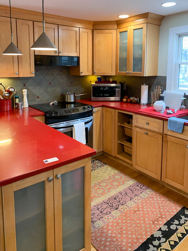
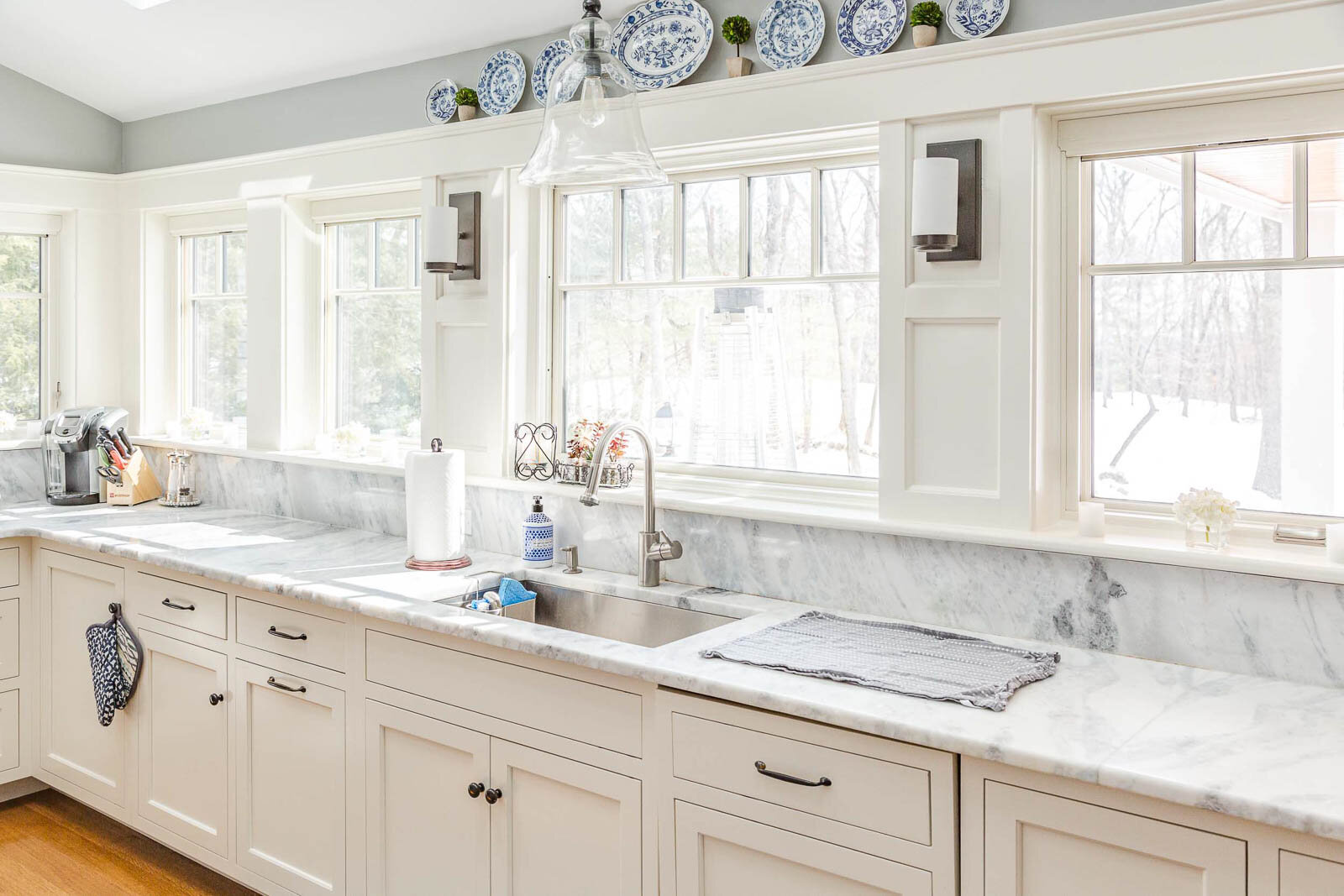
It’s important to establish what aspects within each room are staying vs. what also might be getting an upgrade. For example sake, we’re going to keep this simple and say everything within an existing living room is going to stay as is. Which way do those aspects lean? Are they warmer, beige/ neutral tones or are they cooler, blue/ gray tones? Again, this is all about solidifying direction, eliminating options, and making sure the new selections aren’t going to compete with what will remain.
It’s important to assess the aspects within each space that will remain untouched and what you need to work around. Again, in the theme of eliminating competition and pairing down the possible options, it’s important to establish what tone the remaining aspects are. But first, let’s understand what tones & undertones actually are:
Tones: refer to how a color is altered by adding gray to change its intensity or softness.
Undertones: refer to the subtle hues beneath the main color that influence whether the color feels warm or cool.
Both tones and undertones are important aspects to consider when selecting new interior paint colors. Tone is more important to establish the overall feel of the room (warm vs cool) and the undertones of the new colors are valuable in pulling the entire space all together.
Step Three: Start exploring color immediately
We always advise starting the color selection process as soon as possible, potentially even before you hire a painting contractor to do the work. The less pressure on you to make a decision the better. Internally, we start the color conversation with our new customers immediately, even if the project isn’t slated to start for several weeks. Having time to explore through resources like Google, Pinterst, or YouTube without pressure is critical. It’s also important to view samples within the space over the course of a few days so you can see how the color changes over the course of the day. The best order to explore color is as follows:
Google Search key terms like “warm interior wall colors for a living room”
Pinterest search some of the color names that come up from the Google Search to see more of those colors within finished spaces.
YouTube has some fantastic resources that really dig into how certain colors respond to various settings. One of our favorite channels on YouTube is The Paint People where you can get some great insight into how you could expect a color to perform in your space.
Starting online is a great place to start, but you can’t stop there! It’s very important that once you gather ideas, take a trip to your nearest paint/ hardware store to see those colors in person. Any device screen will skew the way a color looks, so before you get to making up some samples, we advise you to see the colors in person and bring them back to the space that’s to be painted. The color chips are typically free, so don’t be bashful, anything that you’re drawn to take back to the house to see how they feel within the space.
Step Four: Narrow Down & Make Sample Boards
Once you’ve had a chance to assess the paint chips within the space it’s time to start pairing down. I find it’s better to start with a concise 3-5 sample boards within a space because if you make more than that, it can create confusion. You can always make more and making sample boards also costs money. So be conservative in the approach when making the larger sample boards, the first round of sample boards can also help guide the direction even if you don’t love anything you make.
Let’s dig into the sample boards and why we think they’re important. The sample chips you get at a paint store are great, but they’re typically very small and could potentially have multiple colors on them which can skew the way the color actually looks by being right next to it. Having confidence in making a decision is knowing what this new color is actually going to look like, and we find the only way to do that is to purchase pint samples from the paint store and paint them onto 2’ X 2’ posterboard.
The value in the posterboard is it can be moved, so not only can you see it throughout the various areas within the space, but you can assess it against the furniture/ flooring to make sure the undertones work together. If you’re selecting multiple colors, it’s also an easy way to assess how the colors work with each other by placing the boards together or hanging them within the two spaces so both can be seen at the same time.
There is also a great resource in a company called Samplize, where you can purchase peel and stick paint samples. They have a great selection of available colors but not every color under the sun is available. All samples are sent FedEx overnight so often times you’ll receive the samples the next day. These samples are a little smaller than what we’ve already suggested (9” X 14”) which still give a really good idea of what the color will look like, but our motto has always been the bigger the better.
Above we have a photo showing a recent in person consultation we provided, where our customer was having a hard time finding the right “greige” color that would flow well with the existing conditions and an adjoining kitchen that was set to remain untouched. All of these sample board colors looked very similar as smaller paint chips, but you can really see the difference once they’re painted onto the 2’ X 2’ poster board.

Interior Paint Color Examples
Last Step: Listen to Your Gut & No one else!
We have performed literally thousands of color consultations and we find a lot of times the new color will hit you immediately. Some folks just flat out have a hard time making a decision and will continue to explore more color samples just to find themselves coming back to an original selection that felt right from the beginning. That’s all okay and it’s part of the process so don’t stress about it, just give yourself the appropriate time to work through the decision!
The other thing that we will see frequently with folks that have a hard time making a decision is they will pull in a friend or a family member to help them make the decision. Unless that friend or family member is an interior designer, I would refrain from doing so. Color selection is all about what you like and what feels right to you. I’ve been involved in many color consults where a friend helping our customer with color selections starts to take us down the road of what they like, not factoring in what’s important to their friend or our customer. It can create friction too, where you might not want to hurt your friends feelings or have a hard time saying I hate everything you’re selecting!
As a professional painting contractor, I’ve found this aspect can be the hardest part of my job. Anytime I’m helping a customer through color selections, I try to stay as neutral as possible and remain focused on the North Star that we’ve established, making sure the new selections don’t compete, and we stay on course. I’m always happy to make recommendations, but I always start that conversation by saying my opinion doesn’t matter because I don’t live here!
