
2026 Interior Paint Trends for New England Homes
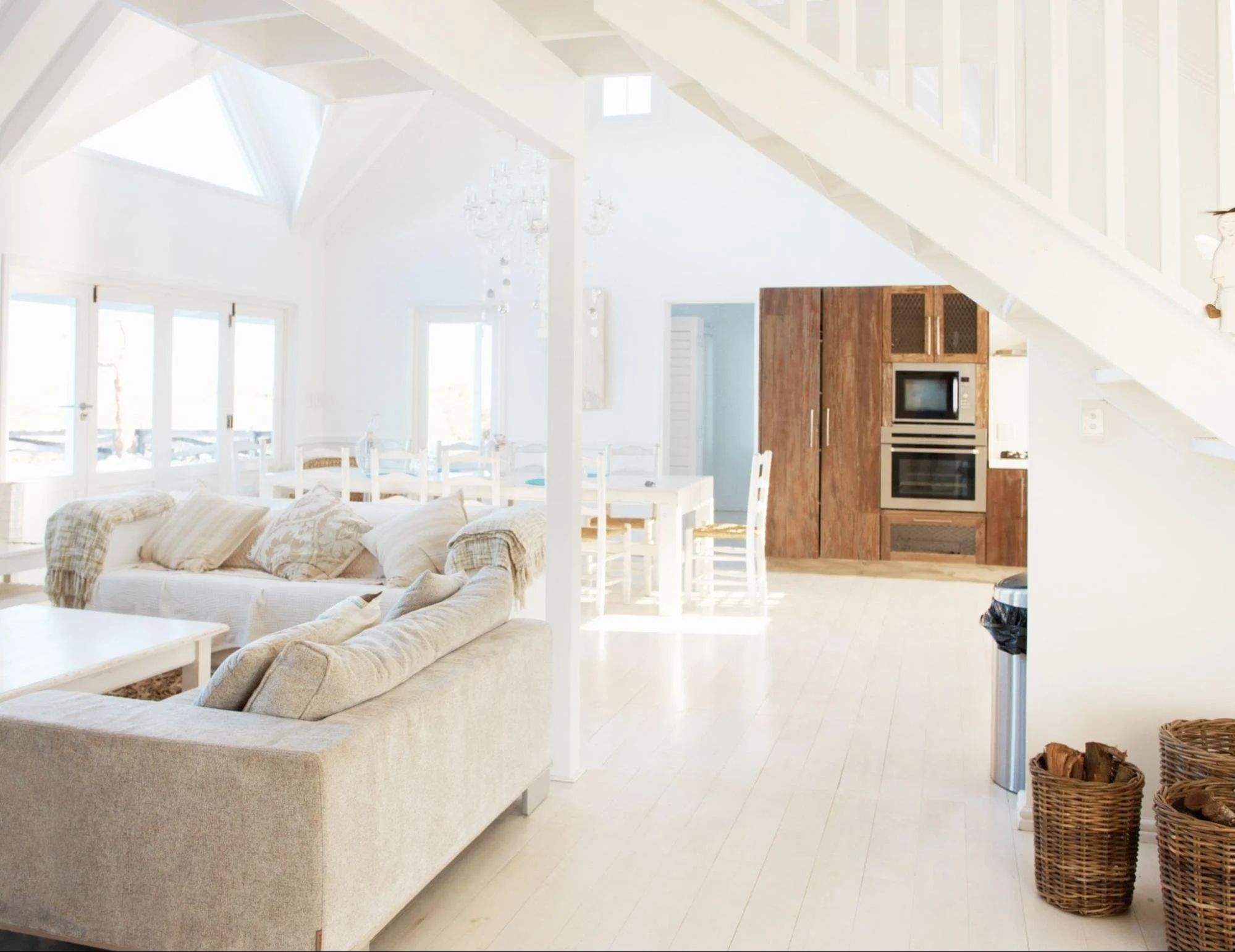
This open-concept living and dining space uses white on the walls, ceiling, and floors to maximize light under a vaulted ceiling, with warm wood cabinetry in the kitchen beyond for contrast. It's a good visual match for the Simply White trend in the 2026 color guide, and proof that an all-white palette can feel warm rather than sterile when paired with natural wood and soft textiles
2026 Interior Paint Trends for New England Homes
Seven colors New England homeowners are actually choosing this year, and how to pick the right one for a room with New England light.
The interior colors we're seeing the most requests for in 2026 are warm neutrals like Benjamin Moore Revere Pewter, deep greens like Farrow & Ball Green Smoke, and warm terracottas like Farrow & Ball Red Earth. All three work well in the kind of older, smaller-windowed homes common across Greater Boston, which is why they keep showing up on our schedule.
At a Glance
- Warm neutrals, deep greens, and warm terracottas are the three color families we're painting most often this year.
- New England homes tend to have less natural light than newer construction, so undertone matters more here than in a sunnier climate.
- Summer is a popular time to repaint interiors, before hosting season or before listing a home.
- Test any color on a real wall in your own light before committing. See our full guide to choosing an interior paint color for the testing process.
The 7 Interior Paint Colors New England Homeowners Are Choosing in 2026
1. Revere Pewter (Benjamin Moore) HC-172 · #CBC6B8
Still the most requested greige in our region, and for good reason. Benjamin Moore built it as a bridge color, something that sits between warm and cool without tipping fully into either, and that's exactly why it works in New England living rooms with a mix of old wood floors and newer furniture. It reads warm in low light but doesn't drift into pink or purple the way some greiges do. At a medium-light reflectance (LRV around 55), it brightens a room without washing it out the way a true white can. Works well in living rooms and open-concept first floors where you want a neutral that flatters both cool and warm furniture, and it's forgiving enough that you can change out throw pillows and art over the years without repainting.
2. Green Smoke (Farrow & Ball) No. 47 · #6F7B71
A deep, slightly grey-green that's shown up in more dining rooms and home offices this year than any other color on our schedule. It's actually an old color: Farrow & Ball notes it was popular in British interiors back in the late 1800s, which tracks with how well it suits the older Colonials and Capes we work on across Greater Boston. It reads almost black in low light and green in daylight, which makes it a good match for rooms with inconsistent light throughout the day. We usually pair it with a warm white trim rather than a cool white, since a cool trim can make the green look flat instead of rich.
3. Red Earth (Farrow & Ball) No. 64 · #BF7B69
A warm, muted terracotta that homeowners have been using on accent walls and in mudrooms. It pairs well with the natural wood tones and brick that show up often in New England homes, and it holds its warmth even in rooms that don't get much direct sun. Farrow & Ball actually recommends it for smaller spaces specifically because it gets richer and cosier as the light drops, which makes it a strong pick for a mudroom or entryway that only sees a few hours of direct sun a day. We'd stop short of using it on all four walls of a large room; it's a color that wants to feel a little enclosed.
4. Hale Navy (Benjamin Moore) HC-154 · #434B56
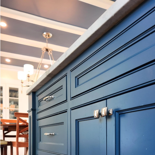
A deep, slightly warm navy that works as well on kitchen islands and cabinets as it does on walls. We're painting more cabinets in this color than any other dark shade this year. It reads sophisticated without going stark black, and at a very low light reflectance (LRV around 8), it absorbs most of the light that hits it, which is exactly why it hides everyday kitchen wear, fingerprints, and scuffs better than a lighter color would. Benjamin Moore markets it as a use-anywhere navy, and we'd agree: it works equally well as an accent island color or a full built-in.
5. Setting Plaster (Farrow & Ball) No. 231 · #D9C0AE
A soft, dusty pink with enough grey and yellow in it that it doesn't read as a "pink room" the way a brighter pink would. Popular in primary bedrooms and nurseries this year. Farrow & Ball named it after the blush tone of a freshly plastered wall, and that's a fair description: it's warm, a little chalky, and reads more like a neutral than a color choice from across the room. It's a good option if you want warmth without committing to a bold color, and it pairs surprisingly well with darker wood furniture if you're not going for an all-white nursery look.
6. Simply White (Benjamin Moore) OC-117 · #F6F6ED
The white we recommend most often for trim, ceilings, and full-room repaints when a homeowner wants brightness without the sterile feel of a stark white. It has a warm undertone and a very high light reflectance (LRV close to 90), meaning it bounces back nearly all the light that hits it, which matters in a New England house that isn't getting floor-to-ceiling sun most of the year. It works with the amount of natural light most homes actually get, rather than the amount of light a paint chip is lit with under store lighting.
7. Off-Black (Farrow & Ball) No. 57 · #454749
Not a true black, a deep charcoal-black with warmth in it. We're seeing this most on doors, built-ins, and occasionally a powder room. It's one of Farrow & Ball's original colors, and it's noticeably milder than their cooler blacks like Railings, which makes it easier to live with on a larger surface like a full built-in rather than just a door. It's a strong choice if you want a moody accent without the maintenance headache of a true matte black, which shows fingerprints and touch-ups more than this shade does.
Color Comparison Table
| Color | Brand | The Vibe | Where It Shines | Finish We'd Use |
|---|---|---|---|---|
| Revere Pewter | Benjamin Moore | The bridge color. Warms up cool furniture, cools down warm wood. | Living room, open-concept spaces | Eggshell |
| Green Smoke | Farrow & Ball | Reads almost black at night, green by day. Moody without trying too hard. | Dining room, home office | Estate Eggshell |
| Red Earth | Farrow & Ball | Gets richer as the light drops, built for a New England dusk. | Accent wall, mudroom | Estate Eggshell |
| Hale Navy | Benjamin Moore | Classic maritime navy that hides everyday kitchen wear better than white ever will. | Kitchen island, cabinets | Advance (semi-gloss) |
| Setting Plaster | Farrow & Ball | Dusty pink with just enough grey that it never reads as "a pink room." | Primary bedroom, nursery | Estate Eggshell |
| Simply White | Benjamin Moore | Warm enough for a house with real New England weather, not a sterile white. | Trim, ceilings, full rooms | Advance or Eggshell |
| Off-Black | Farrow & Ball | All the drama of black without the fingerprint-and-touch-up headache. | Doors, built-ins, powder rooms | Full Gloss or Estate Eggshell |
Color name links open the official Benjamin Moore or Farrow & Ball page for each shade, so you can see it before you commit to a sample board.
Why New England Light (and Older Homes) Change the Color Equation
A color that looks great in a new-construction home with floor-to-ceiling windows can look completely different in a 1920s Colonial with smaller, north-facing windows. Most of the homes we paint across Woburn, Winchester, Arlington, and the rest of Greater Boston get less consistent natural light than homes built in the last twenty years, and that changes how a color reads on the wall.
Undertone matters more here than trend does. A greige with a pink undertone can look dingy in a room that only gets afternoon light. A cool grey can look flat and cold in a room with little direct sun for most of the year. This is part of why the colors above keep showing up on our schedule: they all read warm in average New England light, not just in a paint store lit with daylight bulbs.
Test the Color Before You Commit
Every color on this list looks different in your house than it does on a chip or a screen. Paint a large sample board, move it around the room, and check it morning, afternoon, and evening before you decide. We walk through the full process, including how many samples to test and why you shouldn't ask your friends for their opinion, in our guide to choosing an interior paint color.
Why Summer Is a Good Time to Repaint Your Interior
A lot of the interior work on our schedule this time of year is homeowners repainting before they host family for the summer, or before they list a home for sale in a market where first impressions matter. Windows can stay open for ventilation, and paint dries faster in warmer, less humid stretches than it does in the dead of winter. If you're weighing when to schedule an interior painting project, summer and early fall are typically the easiest scheduling windows before the winter rush.
Frequently Asked Questions
What interior paint colors are trending in 2026?
Warm neutrals like Benjamin Moore Revere Pewter, deep greens like Farrow & Ball Green Smoke, and warm terracottas like Farrow & Ball Red Earth are the colors we're painting most often this year, along with classic choices like Hale Navy for cabinets and Simply White for trim.
What's a good living room color for a New England home?
A warm neutral like Revere Pewter is a safe, versatile choice for most New England living rooms, since it holds its warmth in lower light and works with both cool and warm-toned furniture. If you want something bolder, a deep green like Green Smoke works well in living rooms that get afternoon light.
Do dark colors make a small room feel smaller?
Not necessarily. A dark color on all four walls in a small room with good trim and lighting can actually make the room feel more intentional rather than smaller. Where it can backfire is in a room with very little natural light and no accent lighting planned. If you're unsure, test it with a large sample board first.
Should I paint my cabinets the same color as my walls?
Not usually. Most of the color pairings we do successfully use a neutral wall color with a bolder cabinet color like Hale Navy, or the reverse: a bold wall with white or neutral cabinets. Matching both exactly tends to flatten the room. Our cabinet painting team can walk through pairings during a color consultation.
How do I know if a paint color will work with my home's natural light?
Paint a sample board and check it at three points in the day: morning, midday, and evening. Colors with pink or purple undertones tend to shift the most in low light, which is common in older New England homes. This is covered in more detail in our interior paint color guide.
Ready to Update Your Home's Colors?
If you're not sure which of these colors is right for your space, we offer color consultations as part of every interior painting project. Take a look at our interior portfolio for real examples of these colors in New England homes, or request a free estimate to get started.